The Mac OS X Finder is at the top of everyone's fix-it list. Here's a look at what's wrong with the Finder, and ideas for fixing it.
The original Mac Finder did its job so well that few people thought of it as an application. Back then, the Finder was the system. Throughout Apple's decade of decline after the release of System 7 in 1991, the Finder only saw some minor improvements, many of which were ideas Apple borrowed from shareware tools.
The Finder in Mac OS X
After buying NeXT, the Mac System 7 was renamed Mac OS 7, 8, and then 9, with minor feature bumps in each major revision. The real action at Apple was working to modernize and renovate NeXTSTEP to build what would eventually be released as Mac OS X. 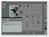

Users hoping for more NeXT technology in the Finder were disappointed that there was no provision for add on bundles, no shelf area in Finder windows to place shortcuts, and among other things, that it looked more like candy than a file browser.
Mac users, including John Siracusa of Ars Technica and John Gruber of Daring Fireball, complained that the new Mac OS X Finder was buggy and slow; suffered from problematic file share networking; lacked many of the shareware-inspired features of the Mac OS 9 Finder, such as windowshade; and was no longer a spatial browser. That meant it was now possible to create multiple, concurrent views of a single folder, and that the set positions of files in a folder were no longer static. Spacial Browserists find that a problem.
Of course, there is no perfect Finder that Apple could deliver to please everybody, but there are some clear problems with the Finder than need to be addressed. By pointing them out, I hope to direct some attention at the flaws that need fixing, as well as opportunities to allow third parties to fix problems that Apple lacks the interest or resources to solve.
Finder Definition
The first challenge to fixing the Finder is in determining what the Finder really does. At first glance, the Finder seems like a simple app that just browses files, but the Finder has inherited responsibility for a wide swath of functionality.
As a filesystem browser, the Finder:
-
•views and edits files’ names, labels, other metadata info, and file permissions;
-
•displays local files and those on remote FTP, WebDAV, SMB and AFP file shares;
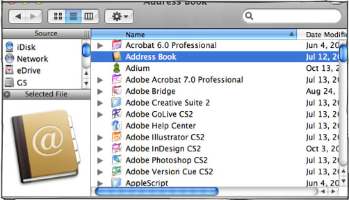
There are also a number of tasks that are commonly executed from the Finder, or seem to be related to the Finder, but are actually handled by other apps. These faceless background applications lack a dock icon, and therefore appear to be part of the Finder. The Dock itself is a separate app, but is closely integrated with the Finder. Other examples:


SystemUIServer manages the Menu Extras icons and menus in the upper right corner. It also determines what to do when a CD, DVD, or blank disc is inserted, or when a scanner, camera or flash memory card is attached.
BezelUIServer responds to things like volume and screen brightness settings by creating the translucent popups. It’s also involved in triggering the Front Row background app, so it’s a target of Andrew Escobar’s enabler patch.
Launch Services handles several things for the Finder, including file icon selection, tracking the default launch application for a file, registering file types an application can open, and updating recent items in the Apple menu.
BOMArchiveHelper creates file archives such as .zip files, and DiskImageMounter manages disk images or .dmg files.
So the Finder isn't always what it seems! In this article, fixing the Finder means solving problems and deficiencies in the main Mac user environment, regardless of the actual applications that might be involved.
I previously wrote about Finder ideas two and half years ago in the Safari Wars and in last year’s Super Finder. Here's an outline of things I'd like to see addressed, some of which come from other’s suggestions or existing products.

Make it Fast:
Make every Finder window an independent thread, so blocking actions don't bog down the entire machine. Apple has made regular progress here with every version of Mac OS X, but it's still frustrating to put a MacBook sleep while connected to a network share, and have it hang the machine for minutes after it wakes up. The Finder needs to learn how to be more resilient to losing network connections, and to learn how to keep chugging on x while y is on fire.
Assign higher priority to foreground actions. The Finder should pay more attention to user demands in the foreground and prioritize responsiveness and quick navigation. The Finder stalls while trying to look up file details, particularly when browsing network shares. When I look around on a file server, I want to see an immediate listing of files, not wait to download fancy icons for everything in each new folder. I also don't want the Finder to stop everything in order to render a PDF’s preview; do that in the background.
 Provide a user preference for snap. People often think Windows is faster than Mac OS X because it feels more responsive or quick; the acceleration speed of the mouse and the flicker of windows as they redraw give an illusion of speed. Additionally, some of the features that contribute to the rich and fluid interface in Aqua are too much for Macs that are slower or have limited RAM.
 Apple should provide a System Preference for interface speed, which changes a series of system UI settings as a set: things like mouse speed, window effects, animations, and shadowing. Users could set their Mac along a sliding scale between “rich interface" and "bare speed" in one simple and easy to set location.
Servisposé: a Heads Up Display for Services. NeXT introduced Services as a way for applications to provide tools to other apps. A program registers its Services with the system, which then makes them available under the Apple Menu. Nobody uses them, because their powerful utility is non-obvious. Borrowing a page from Quicksilver, Apple should set a key command that would take the current selection, pop up a heads up display of things you could do with it, then offer a pipeline of further options.
For example, if you made a selection of text and hit the magic key for Servisposé, you would get a popup with options to: send the text in a new email, start speaking, spell check, look up in Dictionary, Search in Google, and whatever other text-related Services you had running. This would make Services far more useful and obvious, and would drive the creation of useful new ones.
Servisposé could also hand off user interface control to the Service, providing the same HUD style interface to continue performing the action. For example, if you "start speaking" some text, you'd get translucent playback controls that allow you to change the volume and stop playback.
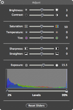
If you select a graphic, invoke Servisposé, and select "correct image," you could perform iPhoto style enhancements to the graphic and then save the file or paste it back into an application.
Servisposé would work like on-demand OpenDoc parts, except rather than replacing apps with components, it would encourage apps to vend Services that were useful system wide.
The Finder could vend its own Services, including "Show as SlideShow," invoking the Tiger viewer for a selection of photos. Did you know the Finder already vends Services to Open, Reveal in Finder, and Get Info? I bet you've never used them.
Servisposé could also act like a smart file launcher. In fact, Apple should just buy Quicksilver and install it by default. It works great, it looks great, and it provides pro users with incredible functionality. As an option, it wouldn't get in the way of entry level users either.
Coming up: More ways to Fix the Finder: Make it Smarter and Make it Prettier.

| | Comment Preview
 Read more about:

 Send |

 Subscribe |
 Del.icio.us |
 Digg |
 Furl |
 Reddit |
 Technorati
Click one of the links above to display related articles on this page.
How to Fix the Finder 1: Faster
Saturday, July 29, 2006


