

Steve Jobs revealed a first glimpse of new Mac OS X 10.5 Leopard features in the WWDC opening keynote address. There are additional details and movies illustrating Leopard and Leopard Server features on Apple's site. Many new features delivered on my wishlist items! Here are some highlights and observations.
Time Machine - Apple delivered my personal server file archive idea with a new "desktop jump" user interface similar to Front Row. Clicking on Time Machine pulls the front window into a timeline interface. Behind the current version are windows showing earlier versions back through time. Select an item from the time you want to recover, click restore, and you are dropped back into the desktop with the retrieved version. Works for Finder windows, iPhoto, and apparently any collection set up to support Time Machine.
This new interface elegantly delivers the functionality of a content versioning system; I think Time Machine is built on top of Subversion. I wrote about this last year in my Leopard Wishlist.
Basically, the system keeps track of files as they change, and instead of throwing away older versions, it keeps successive changes and attaches each a version number and date stamp. Recovering an earlier version is as easy as zooming back to a given date and grabbing the old version out.
Time Machine can dump its repository on an external drive or a server share, explaining the purpose of Server’s Backup services. I have lots of users struggling with using Subversion with a poor user interface; this should make access to SVN repositories easy enough for mom to use effectively. Great job Apple!
As a side note, this is not at all like Window’s System Restore, which allows users to manually backup their system and then revert to it in the case of a major corruption in their system files. There is a version saving system in Windows XP but it never works for me whenever I’ve tried to recover things.
Mail - I thought Apple was trying to prevent users from sending HTML mail, since Mail has never supported creating or sending HTML emails. However, Apple demonstrated iWeb style templates for creating rich emails. You might also call them huge fat emails, but we're in the age of broadband now, so lets waste bandwidth sending emails just as we use cheap disk space frivolously with Time Machine.
Another interesting addition to Mail is Notes support. Think: iPod Notes with support for attachments and graphics. I hope these sync onto the iPod, as that will fulfill my iPod wishlist item for improved Notes.
Along the lines of Address Book, Apple has added both Notes and To Do items as a system wide database with a public API, so developers can build apps that create, change, and work with Notes and To Do items just as they work with Address Book contacts today.
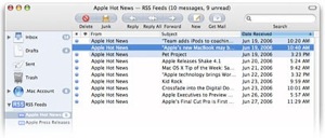
Another cool feature added to Mail is a full fledged RSS newsreader! Subscribe to RSS feeds and handle updates right in Mail, just like a mailing list. Very smart.
iChat - Apple demonstrated Photo Booth effects for iChat, as well as support for backdrops, which replace your background with a video scene for a weatherman effect. Apple also rolled out my idea for Remote Desktop Express, right into iChat. What a great idea: simply start a chat with someone, and then take over the screen to help them. I wonder how many gullible iChat users will hand over their machines to an anonymous stranger in a Nigerian phishing scam?
Also in iChat: remote display of presentations and slide shows with picture in picture effects showing the presenter's webcam; support for multiple conversations in a single tabbed window, and support for connecting to Jabber federation, which opens up IM to work like distributed email servers, rather than users being tied to a proprietary, centralized system such as AIM, MSN or Yahoo! Take down the Man, Apple.
Spaces - Apple also delivered my Stacks idea with a great user interface. My Leopard wishlist asked for a way to package applications together in sets that could be pulled in and out of view like a chef's wheel. Spaces allows users to create virtual desktops containing sets of apps that can be slid in and out of view. I found virtual desktops confusing to navigate working on Solaris, but Apple's implementation looks great. 

Switching to an application from the Dock pulls up its Space, and multiple Spaces can be shown onscreen at once. Apple demonstrated four, but referred to being able to set up "rows and columns," indicating one could go nuts and zoom past Hollywood Squares and into a array of Spaces on the scale of the Muppet Show. With various Spaces tiled on the screen, users can drag application windows from one Space to another.
Dashboard - Apple officially announced Dashcode to build widgets graphically; the tool looked even more refined and drag and drop simple than the versions we saw in Tiger's dev tools. An even simpler tool will allow users send any webpage from Safari to Dashboard, and then crop down the page to make a web clipping, essentially clipping a bit of live Internet that updates as the site does.
This might annoy web publishers who expect readers to view their page in its entirety, along with its advertising, but there's nothing wrong with that. The advertising model of the web is already broken, and viewers already have the capacity to ignore ads entirely. It appears that Webkit would download the entire page, so web servers would see views of their ads, even if viewers can't! Dashboard will also sync settings to .Mac. making it easier to keep multiple machines set up identically.
Spotlight - My Finder wishlist item for a file preview plugin feature is getting delivered through Spotlight as Quick Look. Open files without opening an app. Maybe it will also allow printing? Spotlight is now able to search other machines or files shares on servers, anywhere the user has access permissions. Not many details, but the web page also indicates Spotlight has been optimized to work as an app launcher.
iCal - Rather than bundling iCal, Address Book and Mail into a single Outlook style application as some predicted, Apple has maintained separate apps with integrated features, more like iLife. I'm glad, because I'd like to see an opportunity for third party alternatives. It's much easier for a small developer to create an improved Address Book, for example, than to try to deliver a replacement for an entire Outlook style app. 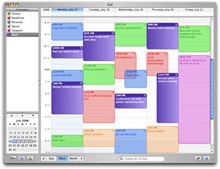

Rather than merge all their apps together, Apple has opened up a public API for all the individual data objects, based upon open standards: iCard contacts and iCalendar events and To Dos. Apple also announced support for iTIP (iCalendar Transport-Independent Interoperability Protocol) and iMIP (iCalendar Message-Independent Interoperability Protocol) in their CalDAV based iCal Server for Leopard Server. This will finally provide an open alternative to Exchange for shared calendars.
Other features making it into iCal are support for booking resources (such as rooms or projectors), an important Exchange style feature missing on the Mac. No announcements on specific improvements in interoperability with Exchange, but even Microsoft is moving toward open standards for messaging, so this is good news all around. Apple also noted that iCal supports dragging files to an event, and will automatically mail the items to all attendees.
Accessibility - Apple announced Braille support and impressive new Text To Speech technology that not only sounds great, but should actually make TTS useful for proofreading. There will be more customized VoiceOver preferences, and support to sync settings via .Mac.
It's great to see Apple building enabling clever new technology to support users with disabilities. It also will enrich and popularize the platform, and enable new applications, particularly with the new highly realistic speech technology.
64-Bit - Support for Universal 64 bit Binaries means that Leopard won't be segregated into incompatible 32 and 64-bit varieties and applications the way Windows currently is. Also, support for 64 bit computing will work on both Power PC and 64-bit Intel architectures with a single data model for developers.
I was surprised to see Apple announce bringing 64-bit savvy to the Cocoa and Carbon libraries, as I thought being 64-bit would have a negative impact on the performance of user interface code.
 Core Animation - This seems obvious in retrospect, but I hadn't guessed that Apple would spin Motion style effects into a standard API to make them available everywhere for developers to spice up visualizations and special effects in their applications. Get ready for Mac that look like the wizzy computers featured in movies, with everything swooping around in clever animations.
The biggest surprise: brushed metal apps appeared throughout the demonstration movies, with the Finder, Safari and Address Book all looking virtually unchanged. Of course, this is only a preview, and the pages note that features are subject to change.
Apple remarked that they are holding on to some secrets, so perhaps we'll get a unified appearance yet. Also unchanged is Mail's unique bubble toolbar that so many people dislike. I'm somewhat ambivalent on the subject; I can find my way around Tiger without trouble, but I'd like to see more refinement and consistency in the interface.
Safari - Users can now search a web page for a word, and results will highlight throughout the page. Individual open windows can also be merged into a single multi-tabbed window, and multiple tabs can be bookmarked as a set. Undo can also reopen a web page in a tab that had been unintentionally closed.
Xcode - We knew Garbage Collection was coming, as well as support for DTrace, the troubleshooting system from Solaris and the first of Sun’s contributions to open source as part of OpenSolaris. Apple has wrapped up DTrace technology in the new Xray, which provides a timeline visualization of application performance to enable developers to optimize their code.
Xcode 3.0 also brings syntax enhancements, runtime performance improvements, and 64-bit development support. There are additional notes on Leopard Server in the previous article.
This Series

| | Comment Preview
 Read more about:

 Send |

 Subscribe |
 Del.icio.us |
 Digg |
 Furl |
 Reddit |
 Technorati
Click one of the links above to display related articles on this page.
WWDC Leopard Sneak Peek Highlights
Tuesday, August 8, 2006


